

Pan Am Responsive website design
Client: Pan American Airlines
Project: Responsive airline booking site
Duration: Approx. 2 weeks
Role: UX/UI Designer
Project Overview
We’ve brought back an old classic…
Pan American Airlines has been a legendary name in consumer air travel. Even though the world had lost them for a period of time, the brand itself forever echoed memories of postmodern opulence and exotic, newly-accessible destinations available to American’s in the mid-20th century.
The Game Plan
Pan American was aiming to launch their rebooted airline within 12-18 months and wanted to have an effective, highly user-friendly online presence. A mobile application is still on their roster of future products, but their main focus was for a desktop and tablet site that can offer real-time updates to customers without the need to download any apps.
High Level Project Goals
Discover pain points/friction in their current online booking experience
Extract information about competition and what makes them successful
Discover what information they find most pertinent to booking
Develop personas and a list of wants and needs for responsive website
Discover what ways a customer might prefer receiving info without downloading app
Research
“One thing I need to be clear on is seating arrangements because I’m very tall.” -Jenny
Research Plan
In order to get Pan Am’s vision “off the ground” we needed to take a look at the market they’d be entering. It goes without saying that 2021 would present entirely different challenges than the brands image had faced before. We relied on secondary research, market analysis and user interviews.
Competitive Analysis
Market research has noted that some of the more aggressive tactics by Pan Am’s largest competitors include larger portions of budget to Loyalty programs in order to maintain their market share. In comparison to participant research, it is apparent that there is also measurable demand from users to meet expectations of reward and amenities.
Cutting Upsells
Though the competition remains fierce, customers maintain the position that garish upselling and frequent promotional materials are off-putting. Customers generally know what they want and are motivated primarily by cost and/or transparency of itinerary.

Market Research & Provisional Personas
Customer Interviews
Criteria for participation:
Adults 18 & up
Any Gender
University Students
Professionals (any industry)
Middle-Upper Income Brackets
Frequent Flyers (any reason)
Competition and Booking Habits
Competition
Over 50% of participants preferred booking through a travel site, favoring Kayak, followed by Skyscanner, and lastly, Cheaptickets. Preferred airlines are: Frontier, Qatar, Jet Blue, EasyJet
Reason for Choice
Cost aside, 50% of participants choose airlines based on service and comfort. Convenience was also a factor. 3 of the 4 participants use 2-3 sites to cross reference before booking.
Time Spent Deciding
This factor varied from minutes to half a year in span. Participants tend to allot more time when deciding to book for more committed travel plans (usually longer-distance/longer duration) and for a better price.
Bare Necessities, Pain and Pleasure
Information Underload
100% of participants stated that they only need essentially (4) details in order to book their ticket. The primary info was: Date, Time, Price, Location. They also (all) claimed that add-ons were unnecessary.
Pain Points
The UX of air travel booking yielded a variety of pain points ranging from: disappointment from hidden fees; pressure to buy quickly; difficulty finding important information; price discrepancy; and slow servers.
Pleasure Points
50% of participants explained how a simple, straightforward site makes booking quick and enjoyable. 1 out of 4 liked the ability to save an itinerary before purchase at a later time.
Research Summary
Air travel is expensive. High-ticket items and their sellers will generally receive much more scrutiny from those who seek to buy. Therefore, there will always be a lot of research that comes with booking a flight.
However, the subtext from research also considers the reality that trust and reliability also matter greatly. Price transparency and forthrightness in the booking process gains the respect (and traffic) of eager frugal travelers AND their busy professional counterparts.
Users tend to have their journeys already in mind and are far-less likely to reserve a car or take a look at another destination regardless of the markdown. Research may even perceive the hard selling as an insult to their intelligence and ultimately an obstacle on their efforts to book their flight.
With all this customer insight, the next step was to form the research into two prominent customer archetypes…
Personas

The Jet-Setting Troubadour

Frequent Flyer Mom Friend
Persona Development
The participants were discovered to splits between three major temperament dimensions: Adventure vs. Conscientious; Impulsive vs. Methodical; Cost-Oriented vs. Service-Oriented. The commonalities between similar participants were then congealed into major attributes such as age and occupation. Lastly, the individuals were given a story and their own personal drives as well as their possible limitations for air travel related to age/lifestyle/income.
Product Roadmap

Now that the project had a set of two co-pilots to assist in driving the design process, the research also provided the essentials for the product road map. This process was integral to laying out the necessary components to what Pan American Airlines would need in order to fulfill an efficient and pleasant user experience for their online booking platform.
The creation of the site map also acted as an introduction to the organization of company information and the importance of core function process. Furthermore, it was an illustration of how the product design would necessitate the partitioning of Pan American’s company content in a digestible way once the user met the website and began it’s main function: to book airfare.
Site Map

User Flow

A “Simple Challenge”
Yes, the user flow does look simple. The competitive analysis and customer research we did yielded this straightforward process as the essential happy path to booking air travel online. But, in the case of this schematic: still waters do run deep.
DESIGN
Now Boarding…
With a deceptively bare user flow, the project was led to the design phase where developing lo-fidelity wireframes began highlighting the technical artistry that would be needed to balance information overload with a clean and satisfying user interface in hi-fidelity deliverables.

WIREFRAMING
While it was evident that travelers have a vast array of reasons to travel, it could be said that the research revealed that less is in fact more. But even with the most pertinent information available, scheduling a long-distance journey is still very serious and secondary information such as luggage allowances, dates of arrival, and in-flight amenities are not far behind in importance.
How to make everything fit and still look pretty?
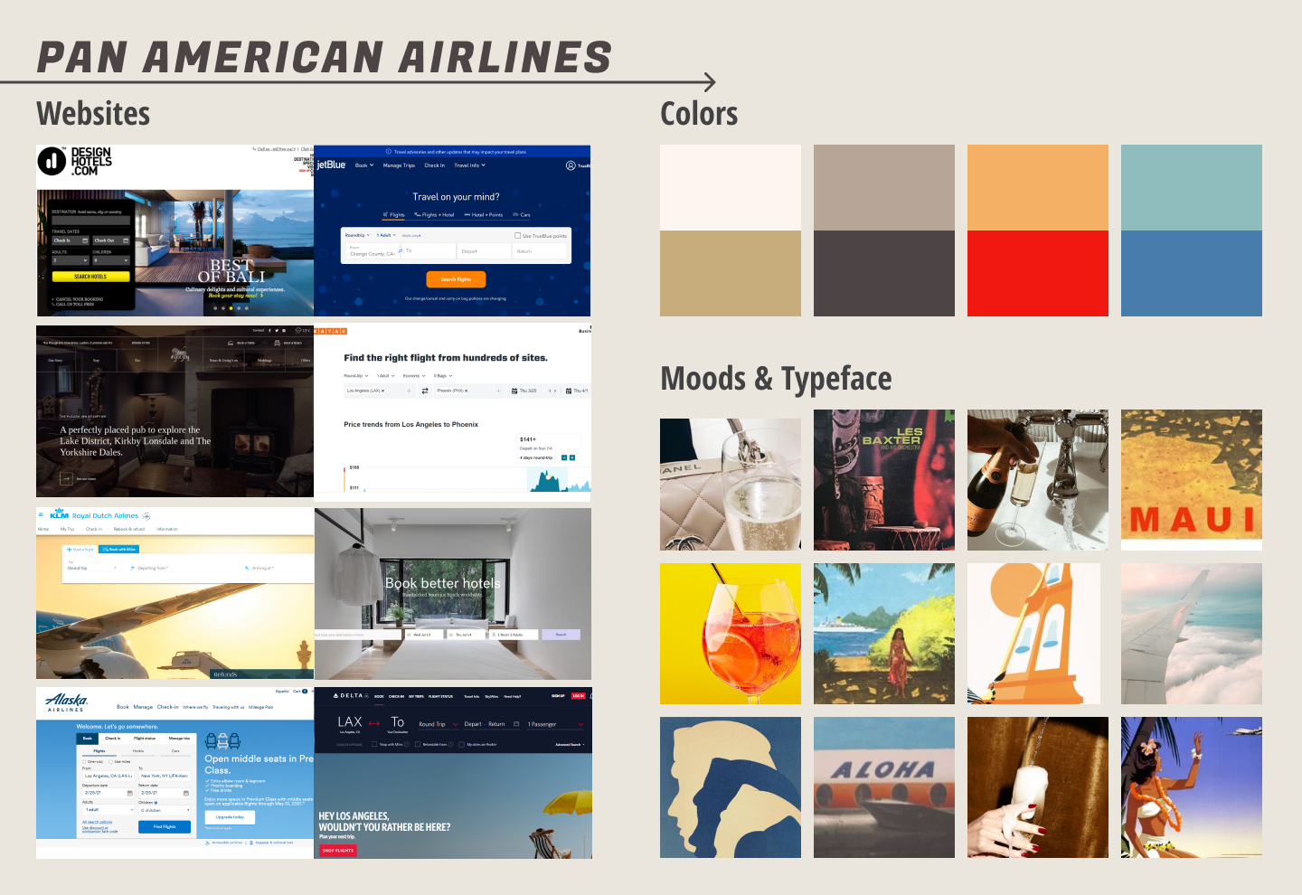
MOODBOARD
The core aesthetic components were chosen to reflect the initial high level goals: clean, luxurious (without being snobbish), and fun.
To satisfy these brand features I first pulled from current samples of high-end travel sites to make sure that whatever was used was represented in a current format.
From there I imagined what Pan American Airlines echoed from the past: exotic South Pacific destinations, postmodern opulence, the joy of adventure.

Brand & Style Tile
The imagery I got was filled with champagne flutes and wine glasses. Travel is often filled with celebratory times as are reunions. And, considering the world was to be reunited with Pan American airlines, I ran with the tagline “Reunions are spectacular”.
To go along with the ‘crystal luao’ motif, I decided to go with ‘playfare’ for the main type and ‘assistant’ for paragraph text to ensure that playfare’s simple elegance would be supported by something sober and contemporary.
For the logo, I chose a simple iteration on the iconic former design to keep things clean, minimal - not straying too far from its core identity.
UI DESIGN KIT

High Fidelity Designs

Pan American Airlines Homepage

Pan American Airlines Booking: Seat Selection

Pan American Airlines Mobile Site Search Results
Timeless Brand Classic Features
The hi-fidelity deliverables feature all the main components that you would find in most other airlines websites. This would be an asset during prototyping and usability testing when test participants were pleasantly surprised with how quickly they could get through the process with such minimal volunteered flight details on the screen.
Test
Prototyping
The prototyping process consisted of organizing the hi-fidelity wireframes in Figma so user tests could confirm the site’s core functionality: to book a flight. To accomplish this we did more research.
Usability Testing
Objectives:
Test functionality and navigability of site
Test site path efficiency from flight search to checkout
Test CTA awareness and effectiveness of CTA design in navigation
Analyze results and optimize for faster, more efficient usability
Test Subject:
Mid-High Fidelity Pan American website (desktop) proto-type
Methodology:
In-person observation: participants will perform the tasks pertaining to the given scenario on the current mid-high fidelity Mirror site prototype via my laptop.
Remote observation: participants will perform the tasks pertaining to the given scenario for this testing phase while screen sharing on Zoom/Google Meet.
Participants:
4 total: (2) men; (2) women
Age range: 23-49
Online airline booking behavior: approx. 1-5 flight bookings a year (online)
Synthesizing Results

Pan American Airlines Usability Testing Affinity Map
Test Findings
The flight booking usability test for Pan American Airlines was performed in-person and remotely via Google Meet. When conducted in person, the test (prototype) was taken on my (product designer’s) laptop via Figma. I first introduced myself as the current product designer at Pan Am and then gave them an explanation of the purpose of the usability test; the scenario that would guide them to completion, as well as a task list to inform them of the functions they would be performing.
Airline booking is a high-ticket process that often involves a lot of research. The main goal for this responsive site was to reduce the friction in the booking process. Aside from the prototype slideshow issues it has become apparent that users had few issues in booking an actual flight. However, the ability for the user to see a date of arrival (as well as date of departure) is important.
Test participant (and CX professional), Daniel Gonzalez explained that it is also necessary to offer the user the ability to see which seats are available vs. taken. Furthermore, the seating tab on the trip summary appears redundant and has caused unnecessary confusion with most participants in this usability test.
Conclusion
After the priority revisions were implemented, the final wireframes were delivered to the stakeholders for approval.
The main challenge met throughout the process was to effectively strip the information available on the screen to what was absolutely necessary and to make salient the secondary information that was almost as important. Ironically, as a result of attempting to make the user flow as minimal as possible, the final prototype interactions screen looked about as complicated as a map of international flight paths.
Decisions of which type of feature to organize the information took consideration. Whether a set of details was to be a dropdown drawer or a modal screen required a few iterations to reach finality.
Despite the deceptive simplicity of the user flow, and the issues that came with ‘ trying to make stuff fit and look pretty’, the challenge of developing Pan American Airlines responsive website was a memorable exercise in UI information priority. With tourism slowly returning and travel bans softening all we can do aside from building Pan Am an effective site is hope business also takes off.
