

MIRROR
Client: Mirror
Project: Responsive E-commerce site
Duration: Approx. 4 weeks
Role: Product Designer
UX/UI
Wireframes/Prototyping
Research
Project Overview
Since Mirror had been established nearly 3 decades ago, it was quickly understood as to who their demographic is and what they required from a digital product. The keyholders had informed the UX operation that what was needed was a brand image overhaul and to develop a responsive site that offered desktop, tablet, and mobile users the ability to navigate the brand’s vast catalogue of styles and content with ease.
Research
Mirror already had a fantastic grasp of their customer base but were in the dark about what they would need when shopping online. To design an effective product I needed to understand what they needed.
After preliminary market research and determining the demographic I needed to study, I scheduled user interviews to gain insight into what they liked about competitor platforms and what they would change if they could.
Sustainability was a definite nice-to-have that was also evident in market research. Social media integration is becoming an absolute must-have.
Meetings were conducted entirely via Google Meet and Zoom.
Persona
I chose a linear approach to Mirror’s site that required some iterations as requested by my product manager (and mentor). Research and design were intimately. In order to bolster the integrity of the design process we invited Teresa G. into our group!

Compiled from our market and customer research and hailing from sunny southern California…meet Teresa G.

Teresa acted as our customer persona and the in-house consultant for our broader design decisions.
The Architecture
The first wireframes were developed as a direct result of her and other Mirror customer brand affiliations. After discovering our users’ sensibilities for organization and doing some investigating of our own on e-commerce trends, we began mapping out our site contents. We first began with a sitemap which illustrated which pages went where and in relation to all the major components of the site in general.

MIRROR Site Map
Design
Our site map and market/user research gave us the foundation we needed in order to begin designing our landing page. Our first design deliverables were comprised of a few sketches of homepage variations that we would use in order to begin wireframing.
Getting Moody
Mirror was enthusiastic about rebranding. They wanted a clean update to their image.
Fresh, inclusive, accessible, and fun were their major brand adjectives. But because of their wide, international customer base I wanted to keep their logo simple and clear. I began by making several sketches of various ideas and decided on a logo that was extremely simple, elegant, and legible.

MIRROR Mood Board
To contrast the simple elegance of the logo, I chose a sunnier colorscape and a sporty mood board as the main contributions to Mirror’s final style guide with primary colors as punctuations I got from fun and sophisticated 1960’s abstract paintings.

MIRROR Intl Style Tile
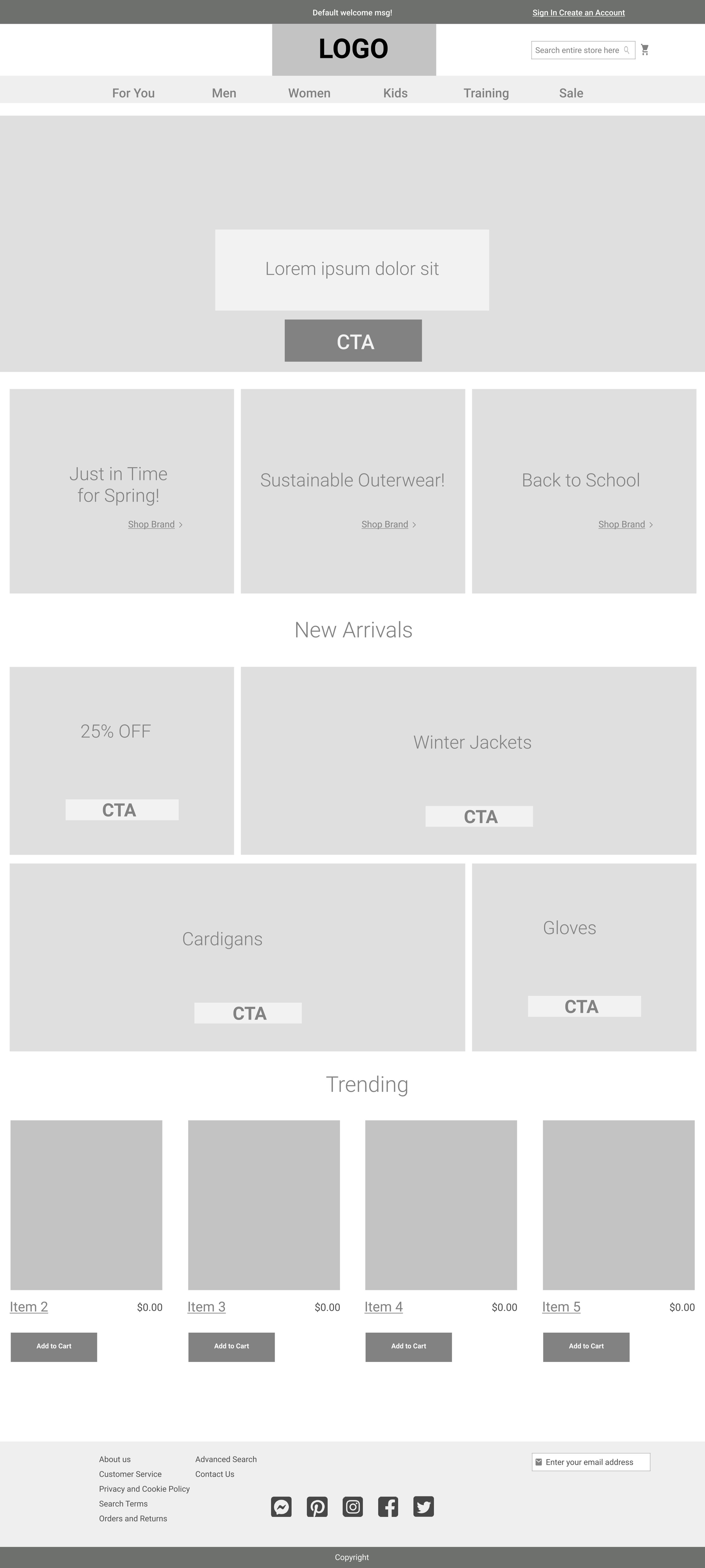
WIREFRAMES
The wireframes and UI were kept simple and organized because the site’s information architecture was in favor of the best way to navigate the user to Mirror’s massive online product inventory.

TEST
With the wireframes reaching higher fidelities, I needed to determine if they were functional. Before handing off the site designs to the development team, we scheduled usability testing sessions over Google Meet and Zoom to check our work for holes in Mirror’s online purchasing process.
Usability Testing
Objectives:
Test functionality and navigability of site
Test site path efficiency from product search to checkout
Test CTA awareness and effectiveness of CTA design in navigation

Fortunately, all participants cleared the scenario in under 2 minutes with some zooming by it in about 1 minute with no help. From testing we determined that aside from a few aesthetic details that were quickly iterated, the site was fully functional and ready to be handed off.
Conclusion
Presently, it could be said that we live in interesting times. The challenges brought upon by living and working under quarantine meant that research processes were held entirely over video calls. This was perhaps one of the most cumbersome aspects of the site design process.
What I found interesting was the impact social media has on e-commerce. Looking back I can see that interview responses and our resulting persona could contribute to more prominent and creative ways to bridge social media with e-commerce functionality in the future.
Usability testing was fun. However, my takeaway from that is to be clearer on scenarios and task lists. The only issue I faced during prototype testing was based on the script.
Ultimately, I’m happy with our product. I’d like to see a cleaner product page in the future with a feature to quickly reduce or add results per page. Less data, overall.
